Matthew Robbins Otoya Rebranding
A comprehensive rebranding project for a boutique events agency, consisting of two separate pillars of the company.
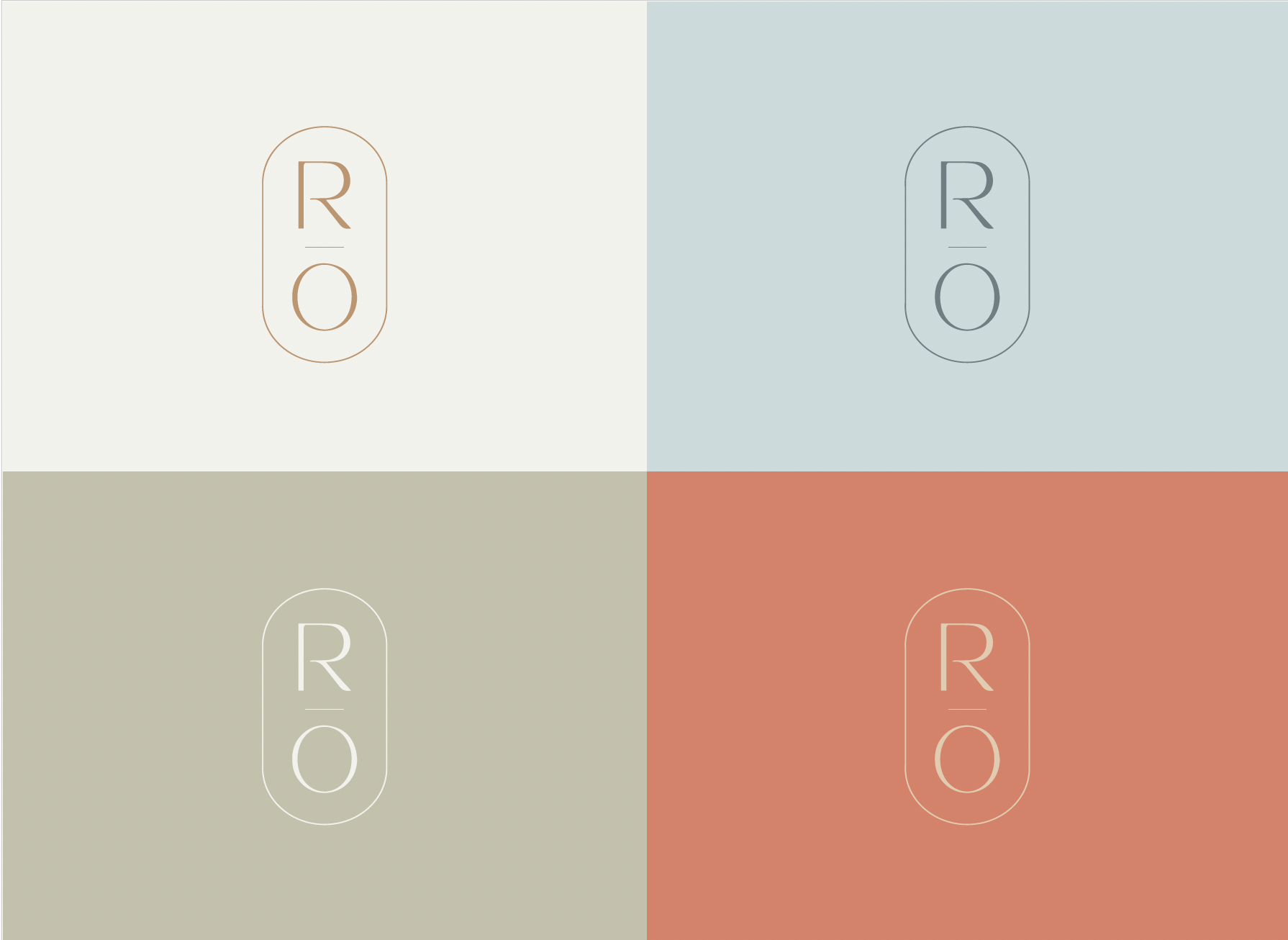
Both logos that have to be unique yet live cohesively together.
We refined its visual identity, messaging, and overall aesthetic to better reflect its luxury services and unique market position.
The rebrand included a refreshed logo and color palette, elevating the company's presence and appeal to a high-end clientele.


Robbins Otoya is the destination pillar of the Matthew Robbins Design parent company.
Focused on tailored events in exotic destinations.